Problem Statement
“The current manual student onboarding process requires an upgrade: a seamless transition from the website to a user-friendly community platform.”
Objectives & Goals
1
Develop an improved community platform for Experience Haus onboarding.
2
Automate student onboarding processes, reducing manual efforts.
3
Create a user-friendly platform that works effectively on both desktop and mobile devices.
4
Ensure a seamless user journey from website to community platform.
Process
Discover
Design
Define
Ideate


Business Challenges
-
Automate student onboarding by identifying and digitizing manual tasks, streamlining communications, and integrating data efficiently.
-
Introduce tiered access levels for the community platform based on user interactions like information sessions or workshops, providing a smooth transition from limited to advanced access.
-
Create a consistent user journey from the Experience Haus website to the community platform, ensuring a cohesive design and user experience.
-
Customize Circle's onboarding process for a seamless brand alignment and user-friendly experience, catering to both desktop and mobile users.
-
Ensure the community platform and processes are responsive, offering a user-friendly experience on desktop and mobile devices through comprehensive testing.


Target Audience
The Curious Newbie The Career Pivoter
The Experienced Refresher
The Motivated Upskiller


Qualitative Research
Student feedback was collected through comprehensive surveys and direct interactions.
“The prep pack was really useful but would be handy to have some more up-to-date resources that we could look at before the course started”
“It was hard to keep track of all the different links & emails before the course started. Once it had started the slack channel was useful as it had everything I needed bookmarked at the top - however sometimes information got lost in the channel”
“I didn't get any confirmation or reminder emails with next steps so I was still a bit confused about how to join the class. I did receive an invite to the Slack channel though and managed to find the course zoom link that way”
“The email was very clear and I knew exactly what my next steps were. Would be nice to not have as many tabs open on my computer”
User Needs
Reduced Complexity: The onboarding process to be streamlined and simplified, with fewer separate resources or platforms to navigate.
Centralised Information Management: Users need a centralised location or system to easily access and manage different files and resources.
One stop solution: less clutter, easy communication, an alumni network, and a friendly community
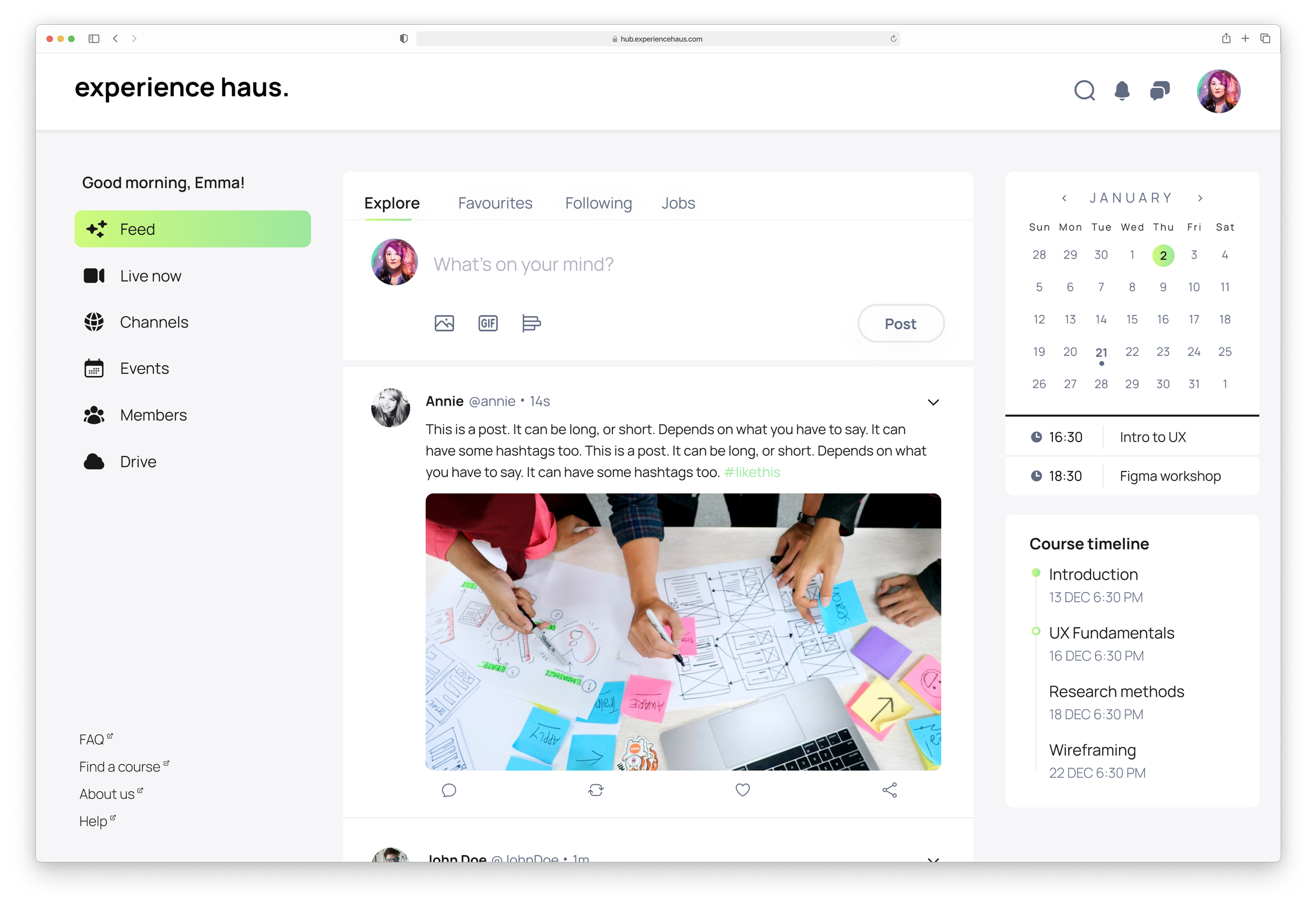
Features & Functionalities
To resolve user needs
Pre-course welcome page
Course slides & resources


Networking & Alumni Channels
Product User Challenges
Some users don’t want to download more apps on their devices
Most users lose track of the emails and have trouble finding what they’re looking for.
When you purchase a course, you need to go through multiple websites to complete their enrolment.
Most users would prefer a central hub that they can go back to during and after their course for all their resources and an alumni community.
User Personas


Eisen Hover Matrix


Task Mapping

Current Taskflows
Part-time Students

Full-time Students

New Taskflow
Part-time & Full-time Students

Sketches


Phase #1 Designs
Following usability testing, these screens underwent iterations to better align with and cater to the specific needs and preferences of users


Eliminated extraneous subpages and features to streamline the platform

Enhanced the sign-up process for a smoother, more modern, engaging and visually appealing experience.
Main Features

NEW STUDENTS

ENROLLED STUDENTS/POST-COURSE
Major Screens


Other Screens